This week has been marred by the rapid spread of COVID-19, or coronavirus, as cities all over the world assess what could be the biggest global pandemic since the Spanish Influenza. Many states have begun regulating whether or not non-essential businesses can stay open in the wake of the news, and many of us are left wondering what we can do to prevent the spread of such an infectious virus. Luckily, data may be the key in showing us how to prevent the spread.
The Washington Post published a brilliant piece on March 14th calling on all citizens of the world to “flatten the curve” while illustrating how quickly diseases like this can get out of hand without regulation. In short, coronavirus’ spread is measured exponentially, as one person infects another, who infects others— multiplying to a frightening number of infected. From one US case confirmed in January, to multiple thousands now confirmed in mid-March, we’ve seen that exponential spread. It’s discouraging to see that kind of spread, to be sure, but despite the frustration that comes with social distancing and isolation, we can use data to illustrate how to stop coronavirus, or at least how to stop its spread.
By utilizing several simulations, the piece in the Washington Post was able to illustrate that while mandated quarantines are effective, they aren’t impervious to human action, meaning that it’s impossible to ensure 100% of a barrier around infected people. As a result, the simulation was adjusted to illustrate what would happen if people began social distancing. Social distancing in this case, refers to intentional isolation, limiting all contact with others in order to prevent the spread of infection. The results of the simulation were remarkable, as infections were reduced well below those present in an attempted quarantine, as illustrated in the following graphs:
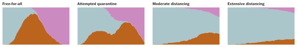
With the blue field representing healthy people, the brown field representing infected people, and the pink as recovered people, it’s evident that if we as a people commit to social distance, we can stop the virus in its tracks, and ensure the health of many, many at-risk people.
While the actual spread of COVID-19 is not able to be perfectly captured in a simulation, it does go to show how much of a difference social distancing can make. No, you can’t quantify everyone down to ones and zeros, as easy as that might make prevention, but the data serves us by illustrating that this isn’t a futile gesture. Regulating ourselves works.
I don’t know what the future holds, or what the world will look like in even a few days, but by breaking down the spread of coronavirus into data points, we can at least illustrate the change you and I can make on the world.
For the sake of our fellow humans, I hope we all band together and keep our distance.